
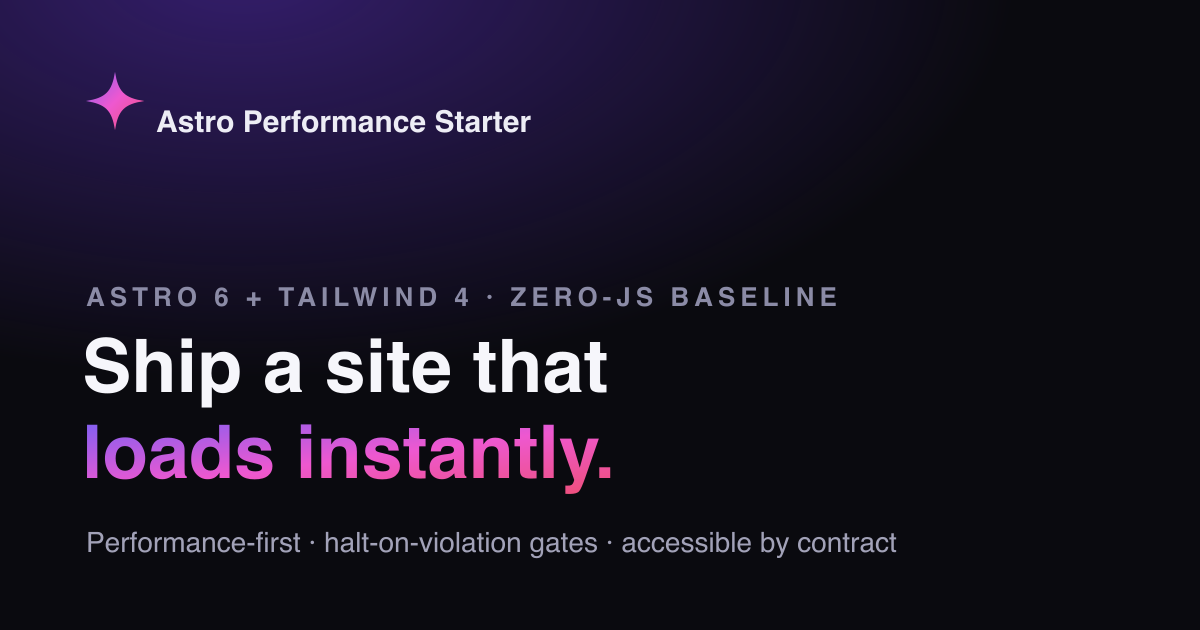
Building This Template: A Ghost's Tour
Seven decisions that hold the Astro Performance Starter together — zero-JS by default, semantic tokens, contract tests, halt-on-violation gates.
4 min read
A performance-first starter, dressed in a cold-minimal, dark-first system. Near-monochrome surfaces; a single animated violet→crimson OKLCH gradient does all the talking. This page is styled entirely by the tokens it documents.
The point of view
Every pixel here is painted by tokens in tokens/base.json —
the swatches, the type scale, the gallery, this paragraph. Change values in one file
and the whole system re-skins: no component edits, no hunting hardcoded colours.
Edit
base.json
Adjust a hue, a step, the gradient stops or the fontFamily group.
Run
pnpm tokens:build
Emits the --color-* and --font-family-* vars components consume.
Gate
pnpm design:validate
Checks WCAG-AA contrast on the gated pairs. Fails the build on a regression.
Ship
this page re-skins
Swatches, type scale, gallery and hero all reflect the new system automatically.
Color tokens
Each family is a 50→950 scale in tokens/.
Roles are pinned: primary/success→violet, secondary/error→rose, warning→amber, neutrals→slate.
The bands and role chips below read the live CSS vars — toggle the theme and watch them flip.
--color-primary-500 --color-primary-600 --color-primary-700 --color-secondary-500 --color-secondary-600 --color-secondary-700 --color-background --color-surface --color-foreground --color-muted-foreground --color-link --color-border --color-border-emphasis --color-primary-foreground --color-success --color-warning --color-error Type specimen
Type is tokenized like colour. The fontFamily
group (display + text) makes the face swappable — change the token and this whole
specimen reflows. Display rides at 700 in Geist; body is Inter, a clean neutral sans.
Display — Geist fontFamily.display
Text — Inter fontFamily.text
Motion
The signature gradient sits up top: two OKLCH interpolations, side by side.
Everything here is compositor-cheap and gated behind
prefers-reduced-motion — turn it on
and every loop settles to a legible resting state.
Gradient A — in oklch shorter hue · vivid, tight
Aurora
Hue takes the short path violet→crimson. Reduced-motion: sweep stops, gradient holds a static frame.
Gradient B — longer hue · full rainbow sweep · shipped
Aurora
Hue takes the long way round the wheel. This is the variant the hero uses.
Conic glow + sheen · @property <angle>
One decorative loop + one specular pass. Reduced-motion: ring holds, sheen off.
Scroll reveal · animation-timeline: view()
Every block on this page enters via the ScrollReveal component — native scroll-driven, no IntersectionObserver. A fixed feTurbulence grain adds depth on the dark surface. Reduced-motion: items render at rest, fully visible. On browsers without animation-timeline (e.g. Safari < 26) reveals are simply skipped and content shows immediately — graceful, still zero-JS, no JS fallback by design (ADR-048).
Everything above is zero-JS CSS. This is the deliberate exception: a single Preact island that controls a CSS animation — play/pause and speed live in a Signal. It hydrates with client:idle, so it costs nothing until the browser is free. The gradient itself is still pure CSS, and it freezes under prefers-reduced-motion regardless of the controls.
Real <button>s; honours prefers-reduced-motion (animation off) even while playing
import MotionLab from "@/components/islands/MotionLab.tsx";

<MotionLab client:idle />
Components
The atoms, molecules, structural primitives, islands and real-world compositions below are imported live — no redesigned mockups, no hardcoded colour. Each consumes the same tokens documented above.
Primitive building blocks. Each is a single Astro component with TypeScript props, design token colors, and built-in accessibility.
Inline label element with variant and size options. Enhanced with prefers-contrast support for users who request higher contrast.
prefers-contrast: more — heavier borders and font weight
<Badge variant="primary" size="sm">Primary</Badge>
<Badge variant="secondary">Secondary</Badge>
<Badge variant="neutral">Neutral</Badge>Polymorphic button/link component. Renders as <a> when href is provided, <button> otherwise. Supports disabled state with proper aria.
Disabled state uses aria-disabled and removes from tab order
<Button variant="primary">Primary</Button>
<Button variant="secondary">Secondary</Button>
<Button variant="ghost" size="sm">Ghost</Button>Hover/focus tooltip upgraded with the Popover API. Browsers that support popover='hint' get auto-dismiss and Escape-to-close. Others fall back to CSS hover/focus.
Visible on focus + hover; Escape-to-close (Popover API)
<Tooltip text="Helpful information" position="top">
  Hover me
</Tooltip>Scroll-driven reveal animations. Replaces AOS, ScrollMagic, and GSAP ScrollTrigger with zero JavaScript. Uses animation-timeline: view() — content animates in as it enters the viewport.
prefers-reduced-motion: respected — content visible immediately
Scroll down to see these cards reveal (they use the same ScrollReveal wrapping this entire page):
<ScrollReveal animation="fade-up">
  <Card>Content reveals on scroll</Card>
</ScrollReveal>Animated counter using CSS @property with <integer> type and counter(). Numbers count up from 0 when scrolled into view — entirely in CSS.
role=img + aria-label exposes counter values to assistive tech
<CounterBadge value={42} suffix="+" label="Components" />Inline SVG from a Lucide-aligned path registry (ADR-055). currentColor means each icon takes its colour from the surrounding text token; size with utility classes.
Decorative icons get aria-hidden; meaningful ones take an ariaLabel
<Icon name="zap" class="size-6 text-primary-600" ariaLabel="Performance" />Wrapper over astro:assets <Image> with project defaults: lazy loading, async decoding, and AVIF/WebP output for raster sources. Width/height are required so layout never shifts.
alt is required by the Props type — no silent missing alt

import hero from "@/assets/hero.png";
<Image src={hero} alt="Hero" width={1200} height={630} />Dark/light switch backed by a tiny inline script — no framework. It flips the .dark class and persists the choice; the whole page re-themes through the tokens. Progressive enhancement: a real button that works the instant JS runs.
Real <button> with aria-label — keyboard and screen-reader operable
<ThemeToggle />
Composite components built from atoms. Interactive patterns using native HTML elements — <dialog>, <details>, radio buttons — instead of JavaScript frameworks.
Base container with optional @starting-style entry animation. When animated=true, the card fades and slides in on first render — visible during View Transitions navigation.
prefers-reduced-motion: respected — no entry animation
<Card animated>
  <div class="p-4">Content with entry animation</div>
</Card>Native <dialog> element with ::backdrop, focus trapping, and Escape-to-close — all browser-provided. Replaces Radix Dialog, HeadlessUI, or any modal library. Entry animation via @starting-style.
Focus trap + Escape-to-close: native to <dialog>
<Dialog id="my-dialog" title="Dialog Title" size="md">
  <p>Dialog content here</p>
</Dialog>

<button onclick="document.getElementById('my-dialog').showModal()">
  Open Dialog
</button>CSS-only tab switching using hidden radio buttons — the same pattern as the Header's mobile menu checkbox. Arrow key navigation via ~15 lines of inline script (WCAG requirement).
Keyboard: arrow keys, Home, End — full WCAG tablist pattern
Panel switching is powered by CSS :has() selectors and the peer-checked: pattern. No framework state management needed.
Pass an array of tab objects. Each panel is a child with data-tab-panel matching the tab ID. The defaultTab prop sets the initially active tab.
Full ARIA support: role="tablist", role="tab", role="tabpanel", aria-selected, aria-controls. Arrow keys navigate between tabs.
<Tabs tabs={[{ id: "one", label: "Tab One" }, ...]}>
  <div data-tab-panel="one" role="tabpanel">First panel</div>
  <div data-tab-panel="two" role="tabpanel">Second panel</div>
</Tabs>Feature card with a headline metric and an expandable detail list, built on native <details>/<summary> — no JS for the disclosure. Icon from the registry (ADR-055).
Native <details> disclosure — keyboard operable, announced as expandable
Fast by default, measured not assumed.
Hardened headers and CI scanning.
<ExpandableFeatureCard
  icon="gauge"
  title="Performance"
  description="Fast by default"
  metric="99 Lighthouse"
  expandedDetails={["Zero-JS baseline", "AVIF images"]}
/>Blog index card — cover, reading time, relative date, tags — driven by a content-collection entry plus computed metadata. Renders a real published post.
Seven decisions that hold the Astro Performance Starter together — zero-JS by default, semantic tokens, contract tests, halt-on-violation gates.
const posts = await getPublishedPosts();
const post = { ...posts[0], metadata: formatPostMetadata(posts[0].data.date, posts[0].body) };
<PostCard post={post} />Portfolio card — cover, title, description, and a tech-stack row — rendered from a real entry in the projects collection (ADR-056).

A fictional product's docs, built to show the starter handling dense, navigable, search-friendly content.
<ProjectCard
  title={p.data.title}
  description={p.data.description}
  image={p.data.cover}
  techStack={p.data.technologies}
/>Layout components that form the page skeleton. The Grid component uses CSS Container Queries — responding to parent width instead of viewport width.
Responsive grid that uses @container queries instead of media queries. The grid responds to its parent container's width, not the viewport — making it truly reusable in any layout context.
<Grid cols={3} gap={4}>
  <Card>Item 1</Card>
  <Card>Item 2</Card>
  <Card>Item 3</Card>
</Grid>CSS scroll-driven parallax. Decorative background shapes move at different rates than content using animation-timeline: scroll(). Replaces Rellax, Locomotive Scroll, or GSAP ScrollTrigger.
prefers-reduced-motion: respected — shapes stay static; aria-hidden on decorations
The hero section at the top of this page uses ParallaxSection. Scroll up to see the subtle background shape movement as you scroll past.
<ParallaxSection intensity="subtle">
  <h2>Content moves at normal speed</h2>
  <p>Background shapes drift with parallax</p>
</ParallaxSection>CSS handles presentation. JavaScript handles state — only when you genuinely need it. This is the one island component in the showcase: Preact Signals for fine-grained reactivity with zero VDOM diffing.
Preact Signals reactive state demo. Uses client:visible for lazy hydration — zero JS cost until the component enters the viewport. Signal updates only re-render the text nodes that changed, not the entire component tree.
aria-label on increment/decrement buttons + visible focus rings
Reactive Count
0
Preact Signals — fine-grained reactivity with zero VDOM diffing. Only the text nodes that change re-render.
import SignalsCounter from "@/components/islands/SignalsCounter.tsx";

<SignalsCounter client:visible />Isolated demos prove a component renders. Compositions prove the system holds together. Below: real UI assembled from the same atoms and molecules shown above — no glue code.
Card + Badge + Tooltip + Button — the building blocks for any blog index, news feed, or content listing. Hover the date to see the Tooltip, click the button for the Card hover state.
All interactive elements keyboard-reachable; tooltip on focus + hover
A deep dive into the radio-button pattern that powers this template's tab component — zero JavaScript, full ARIA support.
<Card animated>
  <article class="p-6">
    <Badge variant="primary" size="xs">Engineering</Badge>
    <h3>Why CSS-Only Tabs Are Faster Than React Tabs</h3>
    <p>A deep dive into the radio-button pattern...</p>
    <Tooltip text="Published 4 days ago">
      <time>Apr 7, 2026</time>
    </Tooltip>
    <Button variant="ghost" size="sm" href="/blog/css-tabs/">Read more</Button>
  </article>
</Card>Tabs + Dialog + Grid + Button — a typical app settings UI. The tabs partition concerns, the dialog handles destructive confirmations, the grid lays out option cards.
Tabs: arrow keys + Home/End. Dialog: focus trap + Escape. Both built into the components.
Follows system preference
English (US)
All enabled
Advanced settings would live here — feature flags, experimental UI, developer tools. Try the arrow keys to navigate between tabs.
<Tabs tabs={[
  { id: "general", label: "General" },
  { id: "advanced", label: "Advanced" },
]}>
  <div data-tab-panel="general">
    <Grid>
      <Card>Theme</Card>
      <Card>Language</Card>
    </Grid>
    <Button onclick="confirmDialog.showModal()">Reset all</Button>
  </div>
</Tabs>

<Dialog id="confirm-reset" title="Reset all settings?">
  <p>This cannot be undone.</p>
</Dialog>
Content
The components Astro maps into MDX content (ADR-027). Authors write Markdown; these render the rich parts — callouts, pull quotes, figures, file-sourced code — all token-styled and zero-JS.
MDX admonition — note / info / success / warning / danger. Status colours come from the role tokens; the icon is optional.
<Callout type="warning" title="Heads up">
  Body content here.
</Callout>Pull quote with optional attribution — semantic <blockquote> + <cite>, styled from the border and muted-foreground tokens.
Ship the artifact, not the apology.
<Blockquote author="Pulci Nella" source="Resident Ghost Dev">
  Ship the artifact, not the apology.
</Blockquote>Content image with a semantic <figcaption>. Pairs src/alt with an optional caption.
<Figure src="/og-default.png" alt="…" caption="The default OG card" />The anchor MDX maps to. Internal links stay plain; external links get target=_blank + rel=noopener and a screen-reader 'opens in new tab' note.
An internal link and an external link (opens in new tab).
[Astro](https://astro.build) {/* in MDX, rendered by Link */}Renders a real source file as a syntax-highlighted block at build time (Expressive Code). The snippet can't drift from the file — it IS the file. src resolves against parentUrl; anchor it to the project root so the path is stable through the bundle.
/** * Demo source file rendered by the `CodeFromFile` showcase example. * It is read from disk at build time and syntax-highlighted by Expressive Code, * so the snippet on /showcase can never drift from this file — it IS this file. */export function greet(name: string): string { return `Hello, ${name}!`;}<CodeFromFile
src="./src/components/mdx/examples/greet.ts"
lang="ts"
title="greet.ts"
parentUrl={`file://${process.cwd()}/`}
/>
SocialLink
Accessible social link pairing a registry-mapped Icon with an accessible label. purpose='share' vs 'profile' tunes the rel/aria semantics.
Show SocialLink code Hide SocialLink code